Wedding Fonts
Introduction to Wedding Fonts:
Wedding Fonts are all about details, and while flowers, outfits, and venues usually steal the spotlight, typography quietly does a lot of the emotional heavy lifting. Wedding fonts are more than decorative choices—they set the tone, communicate personality, and help tell the couple’s story before a single word is read. From invitations to signage and digital announcements, the right font can make everything feel cohesive and intentional.
Choosing wedding fonts isn’t just about what looks pretty. It’s about balance, readability, tradition, and modern taste coming together in a way that feels authentic. Whether you’re planning a grand formal affair or a laid-back backyard celebration, typography plays a subtle but powerful role in how guests experience your wedding.
In this article, we’ll explore what wedding fonts are, why they matter, the most popular font styles used in weddings, how to pair fonts effectively, and how to choose the perfect typography for your wedding theme. By the end, you’ll have a confident understanding of how fonts can elevate your wedding from ordinary to unforgettable.
What Are Wedding Fonts and Why Do They Matter?
Wedding fonts are typefaces specifically chosen to be used across wedding-related materials. This includes invitations, save-the-date cards, RSVP cards, menus, programs, seating charts, signage, thank-you cards, and even wedding websites. While technically any font can be used, wedding fonts are selected with emotion, elegance, and clarity in mind.
Fonts matter because they set expectations. A flowing script font immediately suggests romance and tradition, while a clean sans-serif font feels modern and minimal. Guests subconsciously read these signals the moment they see your invitation. Before they know the venue or dress code, the typography has already told them something about the wedding’s vibe.
Another reason wedding fonts are important is consistency. Using the same fonts across all materials creates a unified visual identity for the event. When everything—from invitations to welcome signs—looks like it belongs together, the wedding feels polished and thoughtfully designed. Even simple décor can feel elevated with the right typography.
Finally, wedding fonts affect readability. No matter how beautiful a font is, it must still be easy to read, especially for older guests. A well-chosen wedding font strikes a balance between style and function, ensuring that information is communicated clearly without sacrificing aesthetics.
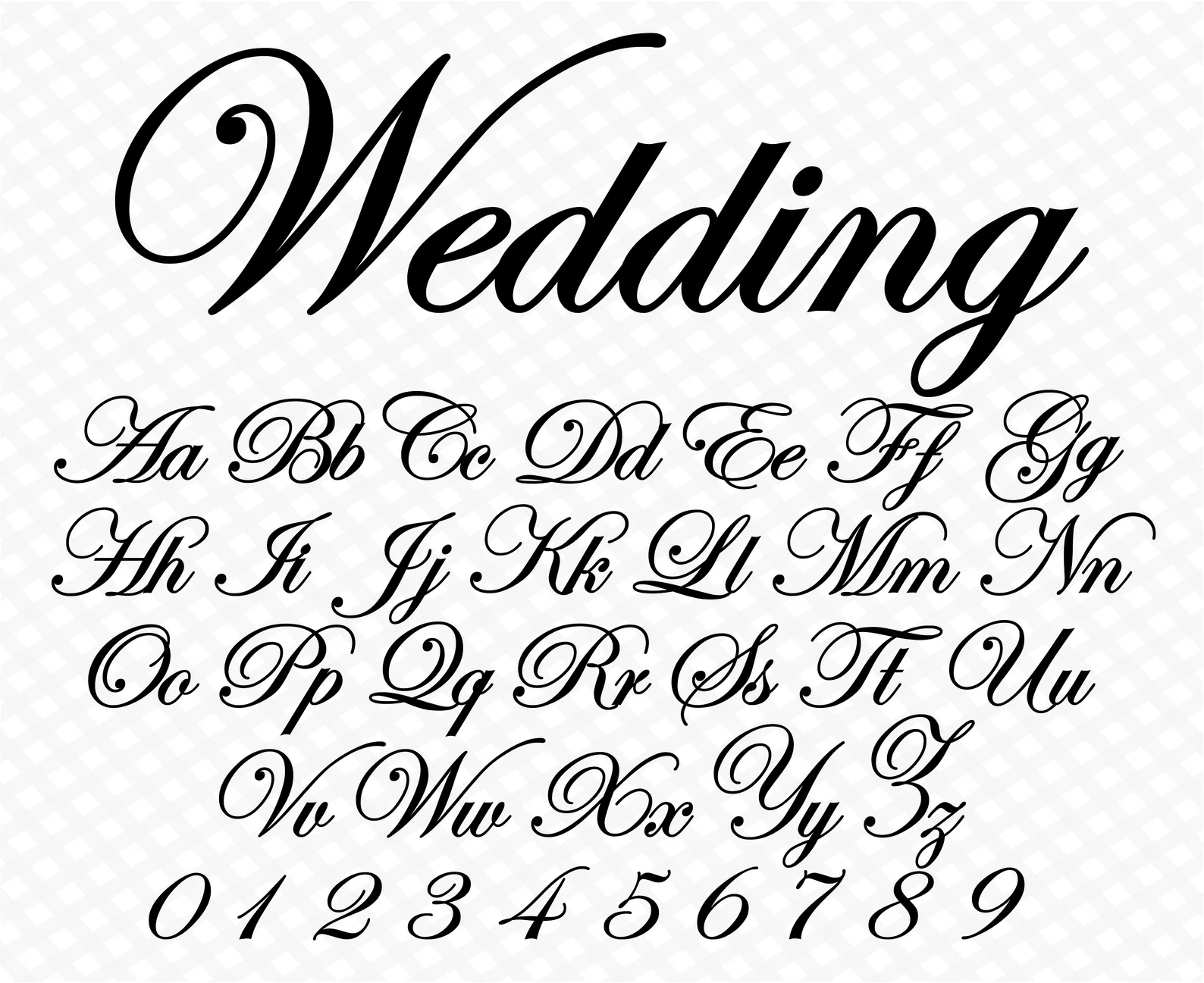
Script Wedding Fonts: Romantic and Timeless
Script fonts are among the most popular choices for weddings, and for good reason. These fonts mimic handwritten calligraphy, often with flowing strokes, elegant curves, and decorative flourishes. They instantly evoke romance, intimacy, and tradition, making them a natural fit for weddings.
One of the biggest strengths of script wedding fonts is their emotional impact. They feel personal and expressive, almost as if each word was written by hand. This makes them ideal for names, headings, and special phrases like “You’re Invited” or “Happily Ever After.” When used thoughtfully, script fonts add warmth and personality to wedding stationery.
However, script fonts need to be handled with care. Highly decorative scripts can become difficult to read when used for long blocks of text. For this reason, experts often recommend using script fonts for titles or accents, while pairing them with a simpler font for body text. This approach keeps things elegant without overwhelming the reader.
Script wedding fonts work especially well for classic, vintage, rustic, or garden-themed weddings. They complement floral designs, soft color palettes, and romantic settings beautifully. When chosen correctly, a script font can feel timeless rather than trendy, ensuring your wedding materials age gracefully.
Serif Fonts for Weddings: Classic and Sophisticated
Serif fonts are defined by the small decorative lines, or “serifs,” at the ends of letters. These fonts have a long history in print design and are often associated with tradition, formality, and elegance. For weddings, serif fonts offer a refined and sophisticated look that never goes out of style.
One of the biggest advantages of serif wedding fonts is readability. Their structured letterforms make them easy to read in both print and digital formats. This makes them an excellent choice for invitation details, ceremony programs, menus, and longer passages of text where clarity is essential.
Serif fonts also convey a sense of importance and gravitas. They’re commonly used in formal weddings, black-tie events, and traditional ceremonies. When guests see a serif font on an invitation, they often expect a well-organized, classic celebration with attention to detail.
Another reason serif fonts are so popular in weddings is their versatility. They pair beautifully with script fonts, creating a balanced contrast between romance and structure. This pairing allows couples to enjoy the elegance of calligraphy while maintaining readability and professionalism throughout their wedding materials.
Sans-Serif Wedding Fonts: Modern and Minimal
Sans-serif fonts, which lack decorative strokes at the ends of letters, are known for their clean, modern appearance. In recent years, these fonts have become increasingly popular in weddings, especially among couples who prefer a contemporary or minimalist aesthetic.
One of the main appeals of sans-serif wedding fonts is their simplicity. They feel fresh, uncluttered, and easy to read, making them ideal for modern invitations, wedding websites, and signage. Their clean lines work especially well with minimalist layouts and neutral color palettes.
Sans-serif fonts also feel approachable and relaxed. They’re often chosen for casual weddings, destination weddings, and outdoor celebrations where formality isn’t the main focus. When paired with thoughtful design elements, these fonts can still feel elegant without being overly traditional.
Another strength of sans-serif fonts is their flexibility. They work well in both large headings and small text sizes, and they adapt easily to digital formats. Many couples choose a sans-serif font as their primary typeface and add a script font for decorative accents, creating a modern yet romantic look.
Decorative and Display Fonts in Wedding Design
Decorative or display fonts are designed to stand out. These fonts often have unique shapes, dramatic styles, or artistic details that make them eye-catching. In wedding design, decorative fonts are typically used sparingly for emphasis rather than for full blocks of text.
When used correctly, decorative wedding fonts can add personality and charm. They’re great for monograms, signage, table numbers, or themed weddings where a specific mood or era is being referenced. For example, an art deco font can enhance a 1920s-inspired wedding, while a bold vintage font might suit a rustic barn celebration.
The key with decorative fonts is moderation. Because they’re visually strong, using them too often can make designs feel cluttered or chaotic. Experts recommend limiting decorative fonts to one or two elements and pairing them with simpler fonts to maintain balance.
Decorative wedding fonts are best chosen with intention. They should reflect the couple’s personality and the overall theme without overpowering the message. When thoughtfully integrated, these fonts can become a memorable part of the wedding’s visual identity.
How to Pair Wedding Fonts Like a Professional
Font pairing is one of the most important—and often most challenging—parts of wedding typography. The goal is to combine fonts that complement each other while serving different purposes. A strong pairing creates visual interest without confusion.
A common and effective approach is pairing a script font with a serif or sans-serif font. The script font adds romance and personality, while the secondary font provides structure and readability. This contrast allows each font to shine without competing for attention.
Another professional tip is to limit the number of fonts used. Most experts recommend sticking to two, or at most three, fonts across all wedding materials. Using too many fonts can make designs feel disorganized and unprofessional, even if each font is beautiful on its own.
Consistency is just as important as pairing. Once you’ve chosen your wedding fonts, use them consistently across invitations, signage, and digital platforms. This repetition reinforces your wedding’s visual identity and makes the entire event feel cohesive and well-designed.
Choosing the Right Wedding Fonts for Your Theme
Every wedding has a theme, whether it’s explicitly defined or not. Your choice of fonts should support that theme rather than clash with it. A formal ballroom wedding calls for different typography than a beachside ceremony or a boho garden celebration.
For traditional weddings, classic serif fonts and elegant scripts work beautifully. These fonts reflect timelessness and formality, aligning well with conventional venues and ceremonies. For modern weddings, clean sans-serif fonts and minimal scripts create a sleek, contemporary feel.
Rustic and bohemian weddings often benefit from relaxed scripts, hand-lettered styles, or soft serif fonts. These choices feel organic and personal, matching the natural textures and informal atmosphere of such events. Meanwhile, luxury weddings may lean toward high-contrast serifs and refined calligraphy to convey exclusivity.
Ultimately, the best wedding fonts are the ones that feel authentic to the couple. Trends can be inspiring, but personal preference should always come first. When your fonts align with your personalities and your vision, the result feels natural and memorable.
Common Mistakes to Avoid When Selecting Wedding Fonts
Wedding Fonts of the most common mistakes couples make is choosing fonts based solely on appearance without considering readability. A font may look stunning at first glance but become difficult to read when printed or scaled down. Always test your fonts in real-world formats before committing.
Another mistake is overusing decorative fonts. While they can be fun and expressive, too much decoration can overwhelm the design and distract from the message. Remember that fonts are meant to support communication, not compete with it.
Inconsistency is another issue. Switching fonts frequently across different materials can make the wedding feel disjointed. Sticking to a consistent font palette ensures a cohesive and professional look throughout the event.
Lastly, ignoring print quality can affect how fonts appear. Some fonts look great on screens but lose clarity when printed. Working with high-quality files and testing prints helps ensure your wedding fonts look just as good in hand as they do on screen.
Conclusion:
Wedding fonts may seem like a small detail, but they have a big impact. They influence how guests perceive your wedding, how information is received, and how cohesive your overall design feels. The right fonts can elevate every element of your celebration.
By understanding different font styles, learning how to pair them, and choosing typography that reflects your theme and personality, you can create wedding materials that feel intentional and beautiful. There’s no single “perfect” wedding font—only the one that feels right for you.
Approach wedding fonts with the same care you give to other design choices. Take your time, test your options, and trust your instincts. When typography is chosen thoughtfully, it becomes a quiet but powerful storyteller on one of the most important days of your life.